
I've been running a technical blog for years. Posts accumulate — but so does everything around them: theme edits, editor migrations, hand-written HTML from 2018, mobile layouts nobody re-checked after the last redesign.
Everything looked fine. So last week I stopped adding posts and audited all ~200 of them instead, read-only first, then fixed only what the audit actually justified.
I did not go in looking for "SEO wins." I went in with five questions: Is the most important heading on a post page consistent across posts? Do headings generated by the theme collide with headings typed into post bodies? Are the accessibility strings I marked as hidden actually hidden? Does anything break on a narrow mobile viewport? If a fix goes wrong, can I roll back?
That framing matters. Google is explicit that there's no magic number of heading elements that ranks better — semantic heading structure is useful primarily because it describes the document, and screen reader users depend on it (SEO Starter Guide). So the goal was a more predictable document, not a ranking claim I can't back up. H1s were split between the theme and the post body
On a themed blog, the platform renders the post title and the editor renders the body — separately. Manage those independently long enough and you end up with the site name, the post title, and a body heading all rendered as .
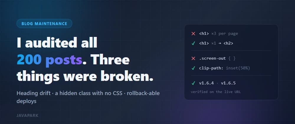
I fixed the shared theme template first, then swept every post for body-level . Five posts had them. Eight headings total.
The rules I applied: The post's primary heading belongs to the platform's title field. Nothing else competes for it. Body sections start at . Keep and below only where the nesting is real. Never fake a heading by bumping font size.
Then — and this is the part that actually caught mistakes — I re-checked on the public URL, not in the editor preview. A visually-hidden class with no CSS behind it
Classic screen-reader-only label. Except there was no .screen-out rule in the stylesheet. The class name was doing nothing. On desktop it was easy to miss; on a phone it wrapped to two lines and squashed the search box next to it.
The tempting fix is to delete the . That's the wrong fix — it removes the only thing telling a screen reader what the input is for. The right fix is to hide it visually only:
Note what this deliberately avoids: display: none and visibility: hidden both remove the element from the accessibility tree. And pushing it off-screen with left: -9999px can cause the viewport to scroll sideways when the element receives focus. The clip-based pattern keeps the text available to assistive tech while occupying no visual space.
After the fix, at a 390px viewport the search region measured 343px wide with a 275px input, and no horizontal overflow.
Hiding something and deleting its accessibility information are not the same operation. Before you fix a layout bug, find out why the markup exists. I shipped this as two versions, not one
I could have bundled both fixes into a single theme update. I didn't: v1.6.4 — heading structure across the site v1.6.5 — the visually-hidden style for the list search label
Each got its own archive, its own version entry in the platform's theme library, and a recorded SHA-256 of the deployed bundle.
Version numbers on a personal blog theme aren't vanity. They're the rollback mechanism. If something surfaces in a week, I need to know which change to revert — and "the update I did on Tuesday" is not an answer.
Minimum viable discipline for any hosted-theme edit: Back up the currently live theme before applying anything. Use a version number that maps to one coherent change. Keep a record of what you verified on the public site after applying. Verifying in the admin panel is not verifying
Editor previews and theme-editor previews both lied to me at least once during this. Caching, template placeholders, and editor-generated HTML all mean the code you saved is not necessarily the HTML that ships.