
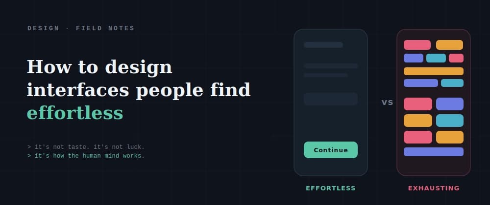
The one where everything is just there — you know where to click, the next step is obvious, you finish what you came to do and barely remember the screen. And the other one: technically it works, nothing is broken, but using it feels like wading through mud. You can't quite say why. It just… drains you.
Here's the thing most people never learn: the difference between those two isn't taste, and it isn't luck. It's science. Every "this feels effortless" and every "why is this so annoying" traces back to how the human mind actually works — and once you know the handful of principles behind it, you stop guessing at design and start fixing the real cause.
This is a practical tour of that science. Not a lecture — a set of design problems you've definitely felt, each one paired with why it happens and how to fix it. By the end you'll be able to look at an interface and name what's wrong, which is the entire difference between decorating and designing.
Quick map, because it makes everything after it click: Cognitive science is how the human mind works — how we perceive, remember, pay attention, and make decisions. It's the raw material you're designing for. HCI (Human-Computer Interaction) takes what we know about the mind and turns it into principles for how people should interact with systems. UX/UI is where those principles actually get applied — the real screens people touch.
So the chain is simple: cognitive science explains the human → HCI turns that into design principles → UX/UI is where you apply them. When a design "just feels wrong," it's almost always violating something one layer down. Good design isn't a mysterious gift — it's these three, connected.
Now let's see it in action. Here are the problems, and the science that fixes each.
You've abandoned a signup or checkout because it threw everything at you at once — a wall of fields, options, and instructions. It didn't feel hard, exactly. It felt heavy.
The science: human working memory is tiny. We can only hold a few pieces of information in mind at once (this is the heart of cognitive load, and it's why "Miller's Law" gets cited so much). When an interface dumps everything on screen simultaneously, it overloads that limited space, and the brain responds the way it always does to overload: it wants to leave.
The fix: break it up. Split a long form into clear steps. Reveal advanced options only when needed (progressive disclosure). Group related fields so the brain processes chunks, not chaos. The exact same twenty fields, shown five at a time across four steps, feels dramatically lighter — because now it fits in the space the mind actually has.
You land on a screen and everything is competing for your attention — five buttons, all the same size, all shouting equally. You freeze for a second, unsure which one you're supposed to press.
The science: the more choices you present, the longer and harder the decision becomes (Hick's Law). Every option adds a little processing cost, and when options pile up with no hierarchy, you turn a simple action into a puzzle. Simplicity isn't just an aesthetic preference — it's literally faster to use.
The fix: reduce and prioritize. Most screens have one action that matters most — make it the obvious primary, and visually demote the rest. Fewer choices, one clear path. If you can't remove options, at least rank them, so the eye lands on the important one first instead of weighing all five.
Especially on mobile: the target is small, or crammed next to three other things, and you tap the wrong one, or miss entirely and have to try again. Small annoyance, but it adds up into something that feels clumsy and cheap.
The science: how long it takes to hit a target depends on its size and its distance from you (Fitts's Law). Small, far-apart targets are genuinely slower and harder to hit — that's not the user being careless, it's a measurable property of how movement and aiming work.
The fix: make important, frequent actions bigger and easier to reach. On mobile, respect the thumb zone — put primary actions where thumbs naturally land, not in a tiny corner. Give tappable things enough size and spacing that hitting them requires no precision. Effortless means the user never has to aim.
You press a button and… nothing visibly changes. So you wait. Then you press it again, unsure. Maybe you just submitted the form twice. That flicker of doubt — did that work? — is a small but real discomfort.
The science: the brain expects feedback for its actions. In the physical world, everything you touch responds — press a real button and it clicks and moves. When a digital action produces no visible reaction, the mind is left in uncertainty, and uncertainty is a genuine cognitive cost. Silence reads as "broken."
The fix: every meaningful action needs a visible response. A button that shows a loading spinner. A saved-confirmation. A subtle state change. It doesn't have to be loud — it just has to answer the question the user is silently asking: did that work? Feedback is how you replace doubt with confidence.